Typography You Can Taste

Interview by Esther Leech
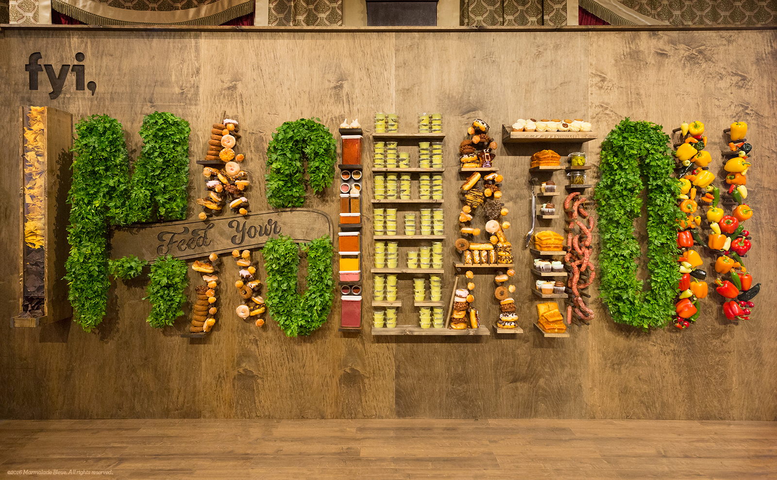
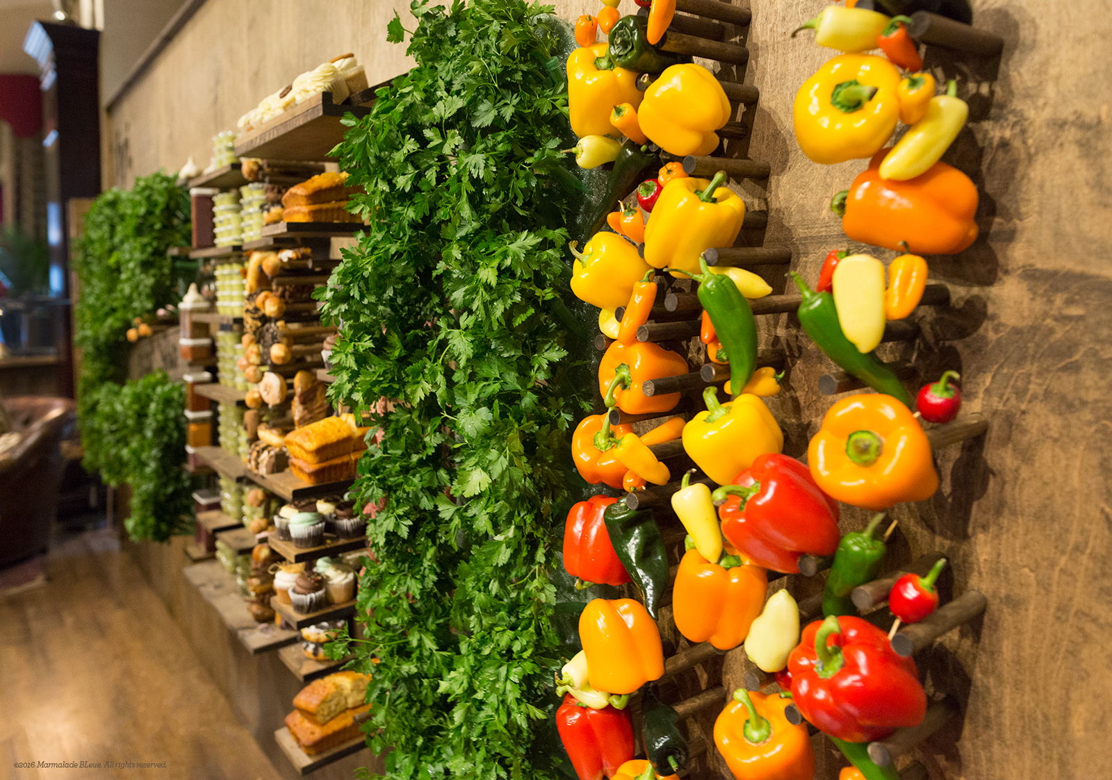
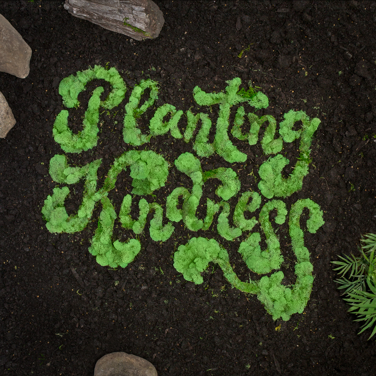
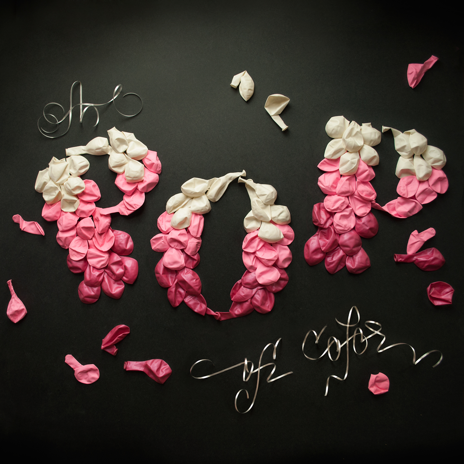
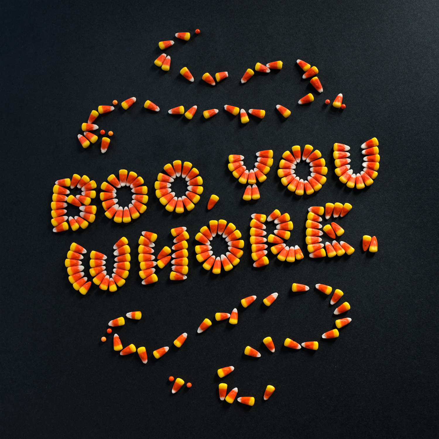
Marmalade Bleue is the taste making studio of designer and lettering artist, Danielle Evans.In 2013, Danielle combined her love of lettering, design, photography, and eating to create food typography. Her work is internationally regarded as both innovative and mouth watering, inspiring new trends in social campaigns, advertising, and motion.
What is your favorite part about designing with food and objects?
I enjoy the inherent message each item carries, as we interact daily with these simple objects. They communicate either conversely or complimentarily with every message I've created, adding layers of intentionality to each image. Beyond having a message of their own, various objects also have inherent style, so I'll have a loopier script with ribbon, shoe laces, string, than I would with tape, paper, etc. Being sensitive to these qualities produces a smoother, more natural experience. Perhaps the best part of this process is seeing others react so viscerally to the imagery. I pride myself on resourceful thinking and encouraging others to look at the surrounding world's potential for beauty, rather than utilitarian function.
Was your career path unconventional? And how has it effected your work?
Absolutely, I have one of the strangest careers and liken my journey to a little kid stutter-stepping to kick a ball. First of all, my background is in illustration; I learned to tell stories but struggled to convey my ideas through character design or painting. Later in school, I took a typography course on a whim and fell head over heels for a different kind of character. Letterforms have a nuanced setting and grace I gravitated towards but couldn't cleanly connect to drawing and painting. I'd toyed with adding a minor in photography but was too poor, sculpting but found the skills too inapplicable, even toyed briefly with shifting to culinary school altogether but hated the long hours.
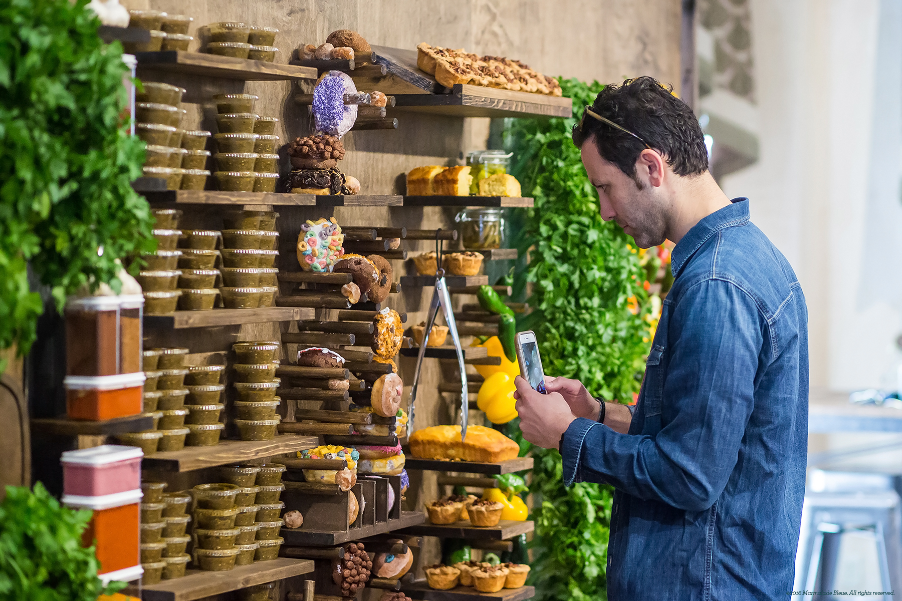
Due to my hodge-podge of interests, I couldn't find a specific position and spent several years hopping from store to store at the mall. While I felt humiliated working minimum wage with a college degree, I learned how to sell things, manage others, and handle feast or famine periods of customer interaction, all skills I utilize daily as an art director and dimensional typographer. When I caught my stride with dimensional type, all my creative interests naturally came together because I was working in a lo-fi setting. I had to photograph everything (who else would believe I made this?) and telling a greater story through styling became a fun challenge. I'm constantly adding new skills to my career like video and animation, which aren't the most intuitive. However, I've also learned to become uncomfortable so I can continue to experiment and forge ahead.
How have the uses of typography changed since you were in school?
Type and lettering have transformed from secondary elements to the hero, even ornamental elements in recent years. The fascination with letterforms has waxed and waned for centuries, but I think we're residing in the golden age of type at present. Even typeface purchases are up in the last three years, as are lettering opportunities for big brands, thanks to the internet. As markets increase, companies are looking for distinction Letterforms are vehicles for motivation - the desire to buy, do, or feel - proving what we say has power despite living in an age of increased communication.
What advice do you have for pursuing an unconventional career like your own?
Embrace the idiosyncrasies you hide. Anything that differentiates you from the hoard of creatives in your industry should be embraced and celebrated within your work. I was ashamed at the imperfections in my lettering, but I realized how freeing it is to accept that limitation. Thankfully the industry was shifting from pixel perfection to a hand crafted vibe, and I caught the wave. I wasn't afraid to cobble together a body of work and shop it around before I understood what I was doing, which helped viewers to guide my chosen materials and feel involved. I'd high recommend sharing portfolio's publicly before they appear flawless.
What do you listen to while you create?
My musical tastes are broad, therefore I try to pick music that compliments the adjectives describing the image. When I need a definitive pick-me-up or a burst of energy, M83's Hurry Up, We're Dreaming is both powerful and playful. CHVRCHES, Band of Horses, Lord Huron, and Fleet Foxes's Helplessness Blues album are fantastic on repeat. I do have a playlist for general work vibes called Childhood/Group Skate on Spotify. On here you'll find Jamie XX's Obvs, My Morning Jacket's Wordless Chorus, Paracosm by Washed Out, Adventures in Your Own Backyard by Patrick Watson and Wow by Beck.
To learn more about Danielle and her work, visit her website here.